


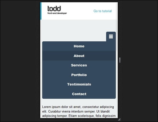
 Mobile Menu
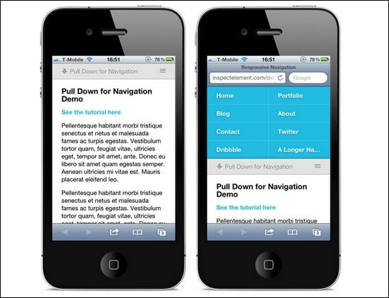
 By InDesign Media |
 May 24, 2020 |
 5661 ViewsMay 24, 2020By InDesign Media
 Responsive designs are more and more frequently used today. Many people started using mobile devices, like smartphones or tablets, to browse the internet. Thus, having a fully responsive website is a must! But what is a responsive design? Responsive designs have specific CSS media queries added, in order to make them fit on any specific screen size. This way, your website will look great and will have different stylings, depending from which device it is read.
Today, we selected 17 best responsive menu tutorials for you, to further enhance your web developing skills. And, it helps to create beautiful responsive websites. Also, these great responsive menu tutorials, come with free scripts you can use and download, at the end of each tutorial.
Want to learn more about responsive designs? So, check out these helpful Responsive Web Design Tutorials.
Drop Down Responsive Menu With CSS3 jQuery
In this tutorial, you’ll create a beautiful drop drown responsive menu with the new features of css3 (media queries) and jQuery library. Similarly, you’ll make a website navigation menu to fit different screen sizes. The design used, is also a nice one, with great styling.
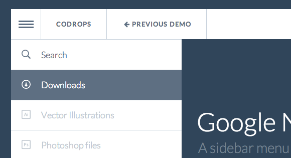
Google Nexus Website Menu (Tutorial & Source Code)
It’s another tutorial, which shows you how to reconstruct the sidebar menu of the Google Nexus 7 page. Moreover, little bit of CSS and Javascript gives it a nice sliding effect with rich modern look. Overall, it’s smartly done and something different for you to try on.

Responsive Select Menu
This is a Responsive Select Menu plugin automatically turns any WordPress 3 Menu into a select box / dropdown on mobile devices. Above all, it takes up less screen real estate on mobile devices, works automatically. Not to metion, there is no need to add extra PHP code and it has easier navigation for touch screens
Pull Down For Navigation
This script offers a simple and effective way of removing a button from the interface and a great use of touch screen input. Also, this pull down technique has been widely adopted among a range of different apps.
Creating a Responsive Menu (Tutorial & Source Code)
This tutorial elaborates the process of creating a Responsive Menu with HTML, CSS & jQuery. Above all, it’s suitable for beginners and intermediate. Overall, the result is also impressive.
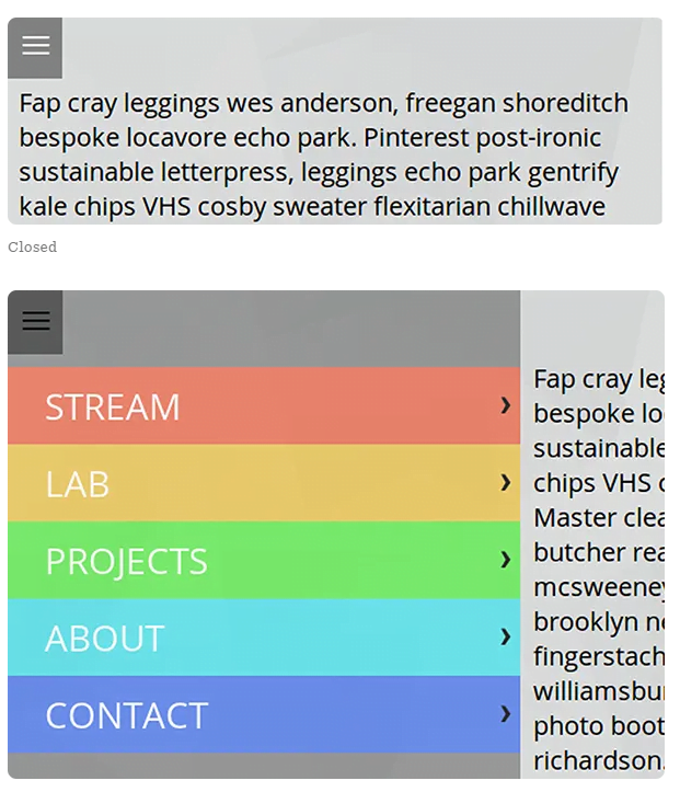
Responsive Menu Concepts
When it comes to responsive design we are faced with various techniques on how to best handle altering our navigation menus for small screens. The resources seem endless. So, I’m going to show you four main concepts and discuss the advantages and disadvantages of all of them.
In addition, three of them are made with pure CSS and one uses a single line of JavaScript.

Responsive Menu CSS3 Tutorial
In this tutorial, you’ll create a responsive menu with css3’s media queries, to modify the layout of a website navigation menu and make it fit to different screen sizes. Particularly, the layout will change from large screens to smaller screens, making it a responsive display.

Responsive Mobile First Navigation
In this tutorial, you’re going to build a simple, responsive web site navigation. Also, this solution will emphasize the content of the page. Above all, there’ll be no JavaScript involved, and you’ll use a Mobile First approach.

Responsive Menu – Create Mobile-Friendly Menu
Highly customisable Responsive Menu Plugin for WordPress. With over 150 customisable options you get a combination of 22,500 options! Not to mention, no coding experience or knowledge is needed with an easy to use interface you can get it looking exactly as you want with minimal fuss.

Responsive Navigation Patterns
This great article offers some of the more popular techniques for handling navigation in responsive designs, like Top Nav or “Do Nothing” Approach, The Footer Anchor, The Select Menu, The Toggle, The Left Nav Flyout, The Footer Only and The “Hide and Cry”.

Flexnav (jQuery plugin)
FlexNav is a mobile-first example of using media queries and javascript to make a decent multi-level menu with support for touch, hover reveal, and keyboard tab input accessibility.

Responsive Drop Down Navigation Menu
The code for this menu is based on the Suckerfish Dropdowns written on A List Apart. Additionally, the demo uses 320 and up with a single style sheet but could be easily adapted to the HTML5 Boilerplate or pretty much anything.

Progressive and Responsive Navigation
Here you’ll find the HTML structure of a navigation menu created by WordPress. The un-ordered list is pretty common for content management systems and hand-coded websites alike. This will be the basis for your work.

HorizontalNav
HorizontalNav is a jQuery plugin that spans a horizontal navigation to fit the full width of it’s container. This plugin makes it easy and adds support for IE7.

Responsive Nav
This is a free, responsive navigation plugin without library dependencies and with fast touch screen support. This tiny JavaScript plugin weights only ~1KB minified and Gzip’ed, and helps you to create a toggled navigation for small screens. t uses touch events and CSS3 transitions too.
HTML5 Responsive Menu with Media Queries JavaScript
Responsive navigation menus come in all different shapes and sizes. This great, helpful tutorial will teach you how to build an HTML5 Responsive Menu with Media Queries JavaScript.

Topdrawer
This great tutorial shows you how to create smoother reveal menus in small contexts using CSS3, rather than animating with JavaScript. The method is very user friendly and has great styling too.

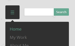
How to Build A “Three Line” Drop Down Menu for a Responsive Website in jQuery
This responsive menu tutorial will teach you how to build a “three line” or “3 line” (?) menu for a responsive website. You’ll do this without adding additional markup to the page. Any additional markup will be added dynamically. You’re going to use jQuery for this.

CSS3 Responsive Menu
In this tutorial, you’ll learn how to create a responsive navigation menu using only CSS3. This is a solution without the use of javascript. Mobile users will be able to easily navigate through your website.

Code A Responsive Navigation Menu
This tutorial will teach you how to code from scratch, a simple but effective responsive navigation menu that you can easily modify and reuse in your own projects.

Responsive Web Nav
There are many ways to create responsive web site navigation. This tutorial will teach you how to build a simple navigation from the ground and using the CSS3 media queries and jQuery to display it in a small screen size properly.
 Share This To:


