


 CSS
CSS 
 By InDesign Media |
 Aug 9, 2019 |
 1368 ViewsAug 9, 2019By InDesign Media
 CSS is capable of making all sorts of shapes. Squares and rectangles are easy, as they are the natural shapes of the web. Add a width and height and you have the exact size rectangle you need. Add border-radius and you can round that shape, and enough of it you can turn those rectangles into circles and ovals.
We also get the ::before and ::after psuedo elements in CSS, which give us the potential of two more shapes we can add to the original element. By getting clever with positioning, transforming, and many other tricks, we can make lots of shapes in CSS with only a single HTML element.
Square

#square {
width: 100px;
height: 100px;
background: red;
}
Rectangle

#rectangle {
width: 200px;
height: 100px;
background: red;
}
Circle

#circle {
width: 100px;
height: 100px;
background: red;
border-radius: 50%
}
Oval

#oval { width: 200px; height: 100px; background: red; border-radius: 100px / 50px; }
Triangle Up

#triangle-up { width: 0; height: 0; border-left: 50px solid transparent; border-right: 50px solid transparent; border-bottom: 100px solid red; }
Triangle Down
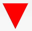
#triangle-down { width: 0; height: 0; border-left: 50px solid transparent; border-right: 50px solid transparent; border-top: 100px solid red; }
Triangle Left

#triangle-left { width: 0; height: 0; border-top: 50px solid transparent; border-right: 100px solid red; border-bottom: 50px solid transparent; }
Triangle Right
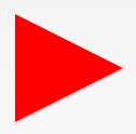
#triangle-right { width: 0; height: 0; border-top: 50px solid transparent; border-left: 100px solid red; border-bottom: 50px solid transparent; }
Triangle Top Left

#triangle-topleft { width: 0; height: 0; border-top: 100px solid red; border-right: 100px solid transparent; }
Triangle Top Right

#triangle-topright { width: 0; height: 0; border-top: 100px solid red; border-left: 100px solid transparent; }
Triangle Bottom Left

#triangle-bottomleft { width: 0; height: 0; border-bottom: 100px solid red; border-right: 100px solid transparent; }
Triangle Bottom Right

#triangle-bottomright { width: 0; height: 0; border-bottom: 100px solid red; border-left: 100px solid transparent; }
Star (6-points)

#star-six { width: 0; height: 0; border-left: 50px solid transparent; border-right: 50px solid transparent; border-bottom: 100px solid red; position: relative; } #star-six:after { width: 0; height: 0; border-left: 50px solid transparent; border-right: 50px solid transparent; border-top: 100px solid red; position: absolute; content: “”; top: 30px; left: -50px; }
Pentagon

#pentagon { position: relative; width: 54px; box-sizing: content-box; border-width: 50px 18px 0; border-style: solid; border-color: red transparent; } #pentagon:before { content: “”; position: absolute; height: 0; width: 0; top: -85px; left: -18px; border-width: 0 45px 35px; border-style: solid; border-color: transparent transparent red; }
Curved Tail Arrow
#curvedarrow { position: relative; width: 0; height: 0; border-top: 9px solid transparent; border-right: 9px solid red; transform: rotate(10deg); } #curvedarrow:after { content: “”; position: absolute; border: 0 solid transparent; border-top: 3px solid red; border-radius: 20px 0 0 0; top: -12px; left: -9px; width: 12px; height: 12px; transform: rotate(45deg); }
Trapezoid

#trapezoid { border-bottom: 100px solid red; border-left: 25px solid transparent; border-right: 25px solid transparent; height: 0; width: 100px; }
Parallelogram
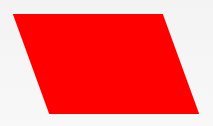
#parallelogram { width: 150px; height: 100px; transform: skew(20deg); background: red; }
Hexagon

#hexagon { width: 100px; height: 55px; background: red; position: relative; } #hexagon:before { content: “”; position: absolute; top: -25px; left: 0; width: 0; height: 0; border-left: 50px solid transparent; border-right: 50px solid transparent; border-bottom: 25px solid red; } #hexagon:after { content: “”; position: absolute; bottom: -25px; left: 0; width: 0; height: 0; border-left: 50px solid transparent; border-right: 50px solid transparent; border-top: 25px solid red; }
Octagon

#octagon { width: 100px; height: 100px; background: red; position: relative; } #octagon:before { content: “”; width: 100px; height: 0; position: absolute; top: 0; left: 0; border-bottom: 29px solid red; border-left: 29px solid #eee; border-right: 29px solid #eee; } #octagon:after { content: “”; width: 100px; height: 0; position: absolute; bottom: 0; left: 0; border-top: 29px solid red; border-left: 29px solid #eee; border-right: 29px solid #eee; }
Heart
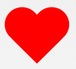
#heart { position: relative; width: 100px; height: 90px; } #heart:before, #heart:after { position: absolute; content: “”; left: 50px; top: 0; width: 50px; height: 80px; background: red; border-radius: 50px 50px 0 0; transform: rotate(-45deg); transform-origin: 0 100%; } #heart:after { left: 0; transform: rotate(45deg); transform-origin: 100% 100%; }
Infinity

#infinity { position: relative; width: 212px; height: 100px; box-sizing: content-box; } #infinity:before, #infinity:after { content: “”; box-sizing: content-box; position: absolute; top: 0; left: 0; width: 60px; height: 60px; border: 20px solid red; border-radius: 50px 50px 0 50px; transform: rotate(-45deg); } #infinity:after { left: auto; right: 0; border-radius: 50px 50px 50px 0; transform: rotate(45deg); }
 Share This To:


